Case Study: Scam Risk Awareness Platform
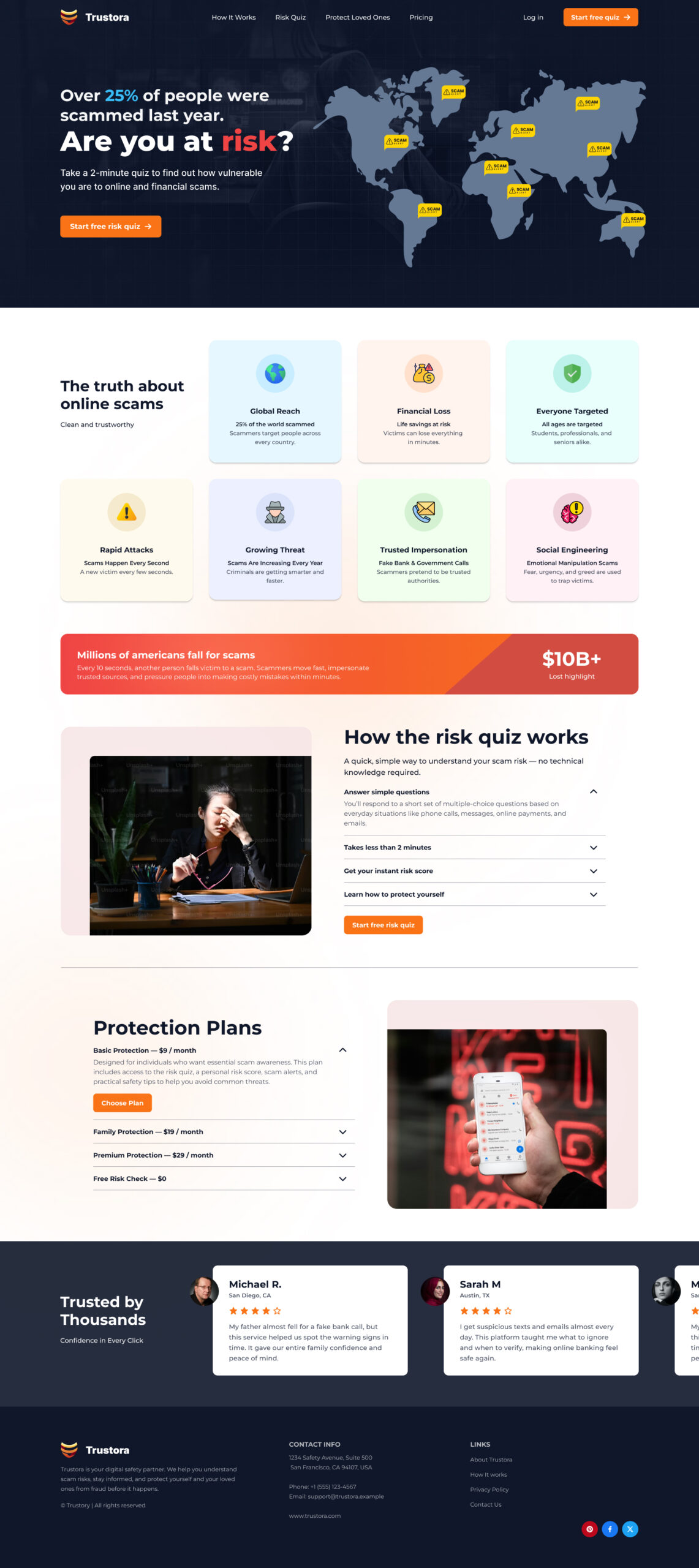
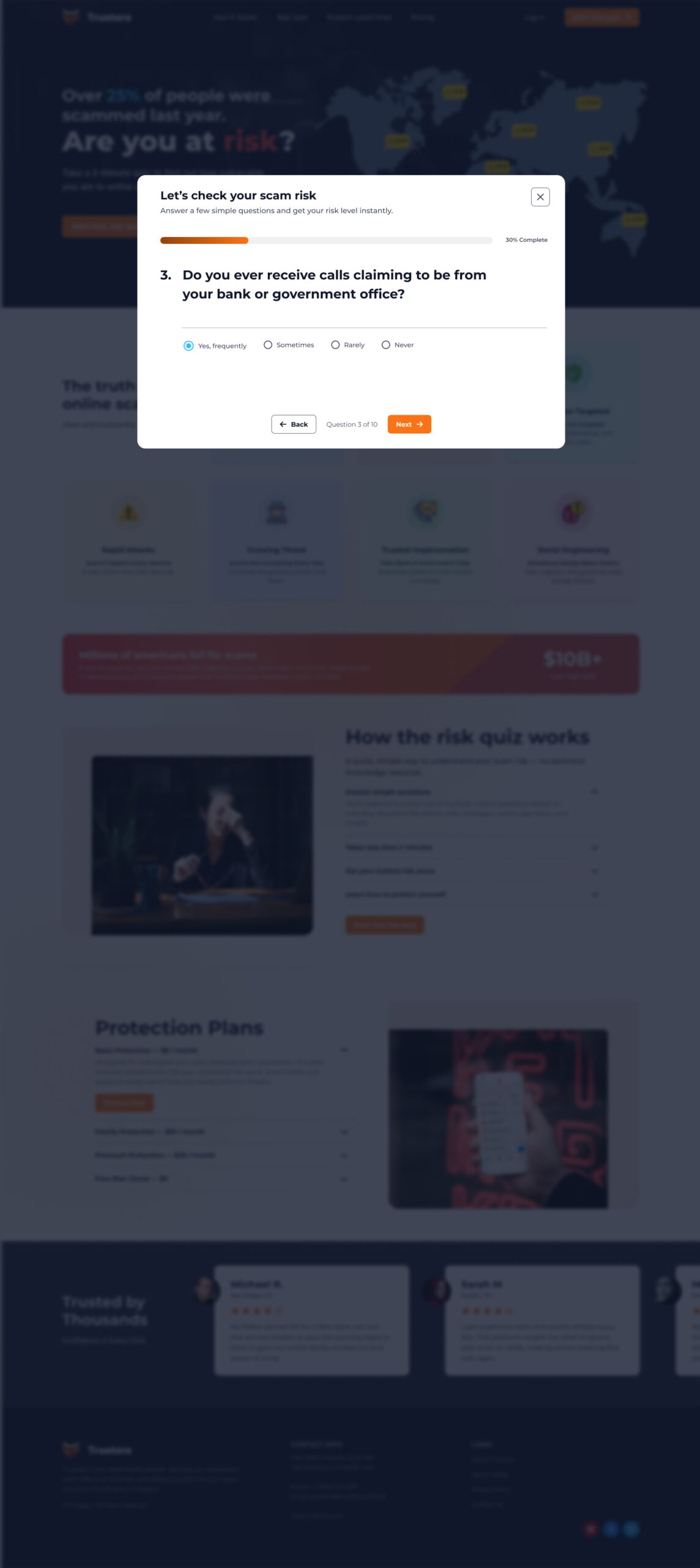
I designed a digital platform to help users identify and reduce their risk of online and financial scams through an interactive quiz and personalized protection plans.


With scams increasing globally, my goal was to create a simple, engaging, and trust-driven experience that encourages users to assess their vulnerability and take preventive action.

Problem Statement

Millions of people fall victim to scams every year, often losing significant amounts of money.


Users:

  • Don’t recognize scam patterns
  • Ignore warning signs
  • Lack awareness about modern fraud tactics


The challenge was to educate users without overwhelming them, while guiding them toward actionable solutions.

Solution

I designed an intuitive platform that:

  • Educates users about scam risks
  • Evaluates their vulnerability through a quick quiz
  • Provides a clear risk score
  • Encourages proactive protection via subscription plans
Key Features

1. Landing Page (Awareness + Conversion)

  • Strong headline: “Are you at risk?”
  • Visual storytelling using global scam data
  • Trust-building sections explaining scam patterns
  • Clear CTA: Start Free Risk Quiz

2. Interactive Risk Quiz

  • One question per screen (reduces cognitive load)
  • Simple multiple-choice answers
  • Progress indicator for motivation
  • Takes less than 2 minutes

3. Risk Result & Insights

  • Users receive a risk level (Low / Medium / High)
  • Clear explanation of what it means
  • Personalized recommendations

4. Protection Plans

  • Tiered subscription model
  • Covers individuals and families
  • Highlights value (alerts, monitoring, education)

5. Loved Ones Protection

  • Users can add family/friends
  • Track their risk levels
  • Protect multiple people under one plan
Design Approach

Visual Direction

  • Dark theme to represent risk & seriousness
  • Bright accent colors (orange/yellow) for alerts & CTAs
  • Clean card-based layout for easy scanning

UX Strategy

  • Minimal friction (quick quiz flow)
  • Clear hierarchy (headline → CTA → trust signals)
  • Emotional triggers (fear + protection + care for loved ones)
Outcome
  • The client was highly satisfied with the modern and conversion-focused design
  • The platform clearly communicates risk and builds urgency
  • The user journey flows smoothly from awareness → action → subscription
What I Learned
  • Simplifying complex problems improves engagement
  • Emotional design (fear + safety) drives user action
  • Clear UX flows directly impact business goals
Trustora