Case Study: Disho
Disho is a cloud kitchen brand focused on delivering fresh, home-style meals with a personal touch.
The goal was to create a visual identity that feels warm, friendly, and memorable while standing out in a crowded food delivery space.
The Challenge
Most cloud kitchen brands tend to look either too generic or overly commercial.
The challenge was to design a logo that:
- Feels homemade and trustworthy
- Clearly communicates food & cooking
- Works effectively across digital platforms and packaging
Approach
I focused on combining simplicity with meaning by merging a letterform with a relevant visual symbol.
The idea was to create something that is both recognizable and expressive without adding unnecessary complexity.
Concept
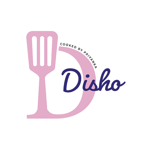
The logo is built around the letter “D”, representing the brand name Disho.
This letter is creatively integrated with a spatula icon, symbolizing cooking and the kitchen environment.
This combination helps:
- Build strong brand recall
- Visually communicate the purpose of the business
- Keep the design minimal yet distinctive
Design Details
Typography
A handwritten-style script is used for “Disho” to reflect a personal and homemade feel, making the brand more approachable.
Icon Integration
The spatula is seamlessly merged with the letterform, creating a unique visual identity that connects name + function.
Composition
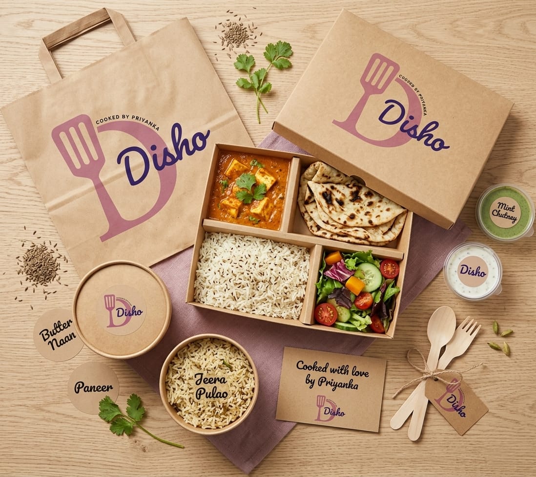
The circular text element (“Cooked by Priyanka”) adds a badge-like structure, making the logo suitable for packaging and branding materials.
Color Strategy
The color palette was designed to evoke warmth and comfort:
- Soft Pink → Represents care, warmth, and a homely vibe
- Deep Purple → Adds contrast and a modern touch
The intention was to avoid typical fast-food colors and create a distinct, friendly identity.
Outcome
The final logo is:
- Simple and recognizable
- Emotionally warm and approachable
- Versatile across multiple use cases
It works well for:
- Packaging (stickers, boxes)
- Social media branding
- Website and digital platforms